Podcast Design
A quick design I made that aims to capture both the modern and clean, while presenting stark colors to demonstrate…
ENG221.000 Spring 2017
A quick design I made that aims to capture both the modern and clean, while presenting stark colors to demonstrate…
For our podcast image, I didn’t realize I was supposed to post it on our pages as a post so I put it in the class ublend first like a total noob. Oh well. I went in on the [www] look and shot for a sort of retro design with the newspaper cutouts and traditional …
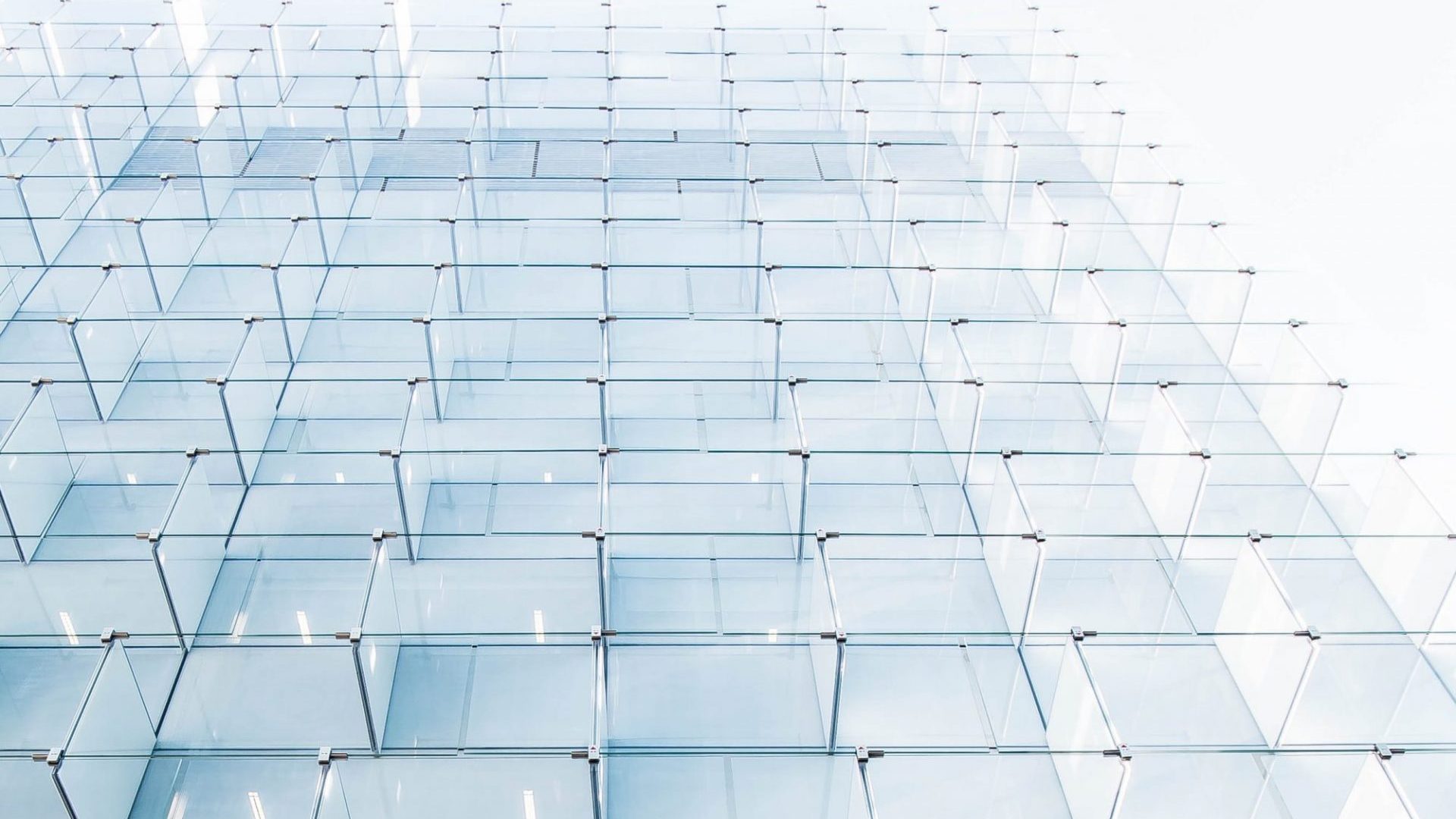
This design shows a meticulous web cast over a symmetrical view of two skyscrapers. I tried to incorporate both images to show that everything in new age media is seemingly connected to the industries that satisfy us, as consumers (whether passively or actively.) Source: http://www.minojh-multimedia.com/services/ the city lights which seemingly give off an illusion of a …
Source: https://www.flickr.com/photos/101295317@N06/
I made my logo on Canva. First time using it, don’t really know how to use it. I would have liked the background of the social media accounts to be faded in and for the title “THE WEB WE WEAVE” to be a wavy font or something. I didn’t know how to change the text …
I made my logo using Canva. This was my first experience with this program but I found it easy to use. My original idea was different from what I ended up making. I just played around with different elements and settled on this.
After stretching my lack of graphic design to a max, I came up with this for a podcast cover image.
This is an idea I had for the potential logo by playing around with some fonts and images. I emphasized WWW…
Above is the image I designed for the podcast. Originally I wanted to play off of the stacked words or the lowercase lettering. However, the alliteration made me think of somehow combining the words into one and adding a digital aspect. That idea sparked the above graphic which I’m fond of, but I wouldn’t mind […]