Warning: Undefined array key "wcttab" in /home/davidmor/eng221s17.davidmorgen.org/wp-content/plugins/custom-tables/custom-tables.php on line 132

Warning: Undefined array key "wcttab" in /home/davidmor/eng221s17.davidmorgen.org/wp-content/plugins/custom-tables/custom-tables.php on line 132

Warning: Undefined array key "wcttab" in /home/davidmor/eng221s17.davidmorgen.org/wp-content/plugins/custom-tables/custom-tables.php on line 136

Warning: Undefined array key "page" in /home/davidmor/eng221s17.davidmorgen.org/wp-content/plugins/custom-tables/custom-tables.php on line 157

Warning: Undefined array key "page" in /home/davidmor/eng221s17.davidmorgen.org/wp-content/plugins/custom-tables/custom-tables.php on line 157

Warning: Cannot modify header information - headers already sent by (output started at /home/davidmor/eng221s17.davidmorgen.org/wp-content/plugins/custom-tables/custom-tables.php:132) in /home/davidmor/eng221s17.davidmorgen.org/wp-includes/feed-rss2.php on line 8
eopsketch – New Media Writing https://eng221s17.davidmorgen.org ENG221.000 Spring 2017 Thu, 23 Mar 2017 16:35:25 +0000 en hourly 1 https://wordpress.org/?v=6.5.2 https://eng221s17.davidmorgen.org/wp-content/uploads/2017/01/cropped-flash-undies-32x32.jpg eopsketch – New Media Writing https://eng221s17.davidmorgen.org 32 32 Equality of Opportunity Project Sketch http://eng221.janetkim.org/uncategorized/equality-of-opportunity-project-sketch/ Thu, 23 Mar 2017 16:35:25 +0000 http://eng221.janetkim.org/?p=142

I was particularly interested in looking at the children’s income distribution in relation to the parent’s income distribution. I thought it was interesting that most children don’t earn as much as their parents since many people go to school and work hard so that the next generation can have an easier life. In the graph above, students who went to higher-tiered schools earned more. Although the only variables in the graph are college tier and the median child individual earnings in 2014, I think it would be interesting to also examine whether region impacts the data and the probability that the child will end up in the same percentile as their parents or even move into a different percentile than their parents. By looking at these variables, we can see whether children are in the same or different income percentile as their parents and how college tiers and region can impact this.

]]>
Data Visualization Idea http://eng221rw.emilybinstok.com/uncategorized/data-visualization-idea/ Thu, 23 Mar 2017 13:03:11 +0000 http://eng221rw.emilybinstok.com/?p=55 Continue reading "Data Visualization Idea"

]]>
In looking at the Equality of Opportunity Project, perhaps an aspect of our data visualization can focus on the social issues of the students. For example, examining race, gender, how many parents per household, how many children per household, whether the parents are employed, whether the student is employed, etc. This will allow us to delve deeper into the story of these students rather than just looking at how much money the parents make, which is certainly not the only contributing factor to their monetary success later in life.

]]>
Sketching Equality of Opportunity Project https://eng221s17.davidmorgen.org/assignments/sketches/sketching-equality-of-opportunity-project/ https://eng221s17.davidmorgen.org/assignments/sketches/sketching-equality-of-opportunity-project/#respond Thu, 23 Mar 2017 12:46:15 +0000 http://eng221s17.davidmorgen.org/?p=855 3/23

Describe what you imagine our collective equality of opportunity project might look like when it’s finished. Describe three or four main sections of that site with a brief description of what sorts of questions or subjects they might address.

[Hit publish and shut my laptop for the night last night, but I guess I shut down too quickly and it never finished publishing. For the sake of record keeping, publishing it now.]

Let’s tag these “eopsketch

]]>
https://eng221s17.davidmorgen.org/assignments/sketches/sketching-equality-of-opportunity-project/feed/ 0
Data Visualization Sketch http://eng221.shivenpatel.org/uncategorized/data-visualization-sketch/ Thu, 23 Mar 2017 05:50:02 +0000 http://eng221.shivenpatel.org/?p=71 Trying to come up with a picture of what I thought this project would turn into seemed like a daunting task. I wasn’t successful until I just dove into the data. After looking for trends and comparing different different values, I came up with this map. The three variables represented on this map are location, mobility rate, and change in percentage of parents from the bottom quintile. As you can tell, the data is divided by the state in which the college is located. The size of the circle represents mobility rate of students in the early 2000s (the larger the circle, the higher the mobility rate). The color of the circle represents the change in percentage of parents from the bottom quintile from 1980-1991 (the darker the red, the greater the decrease in percentage and the darker the blue, the greater the increase). I found it interesting that many states had a decline in the percentage of parents from the bottom quintile Could this simply be because there were less people in the bottom 20% in general or just less parents in the bottom 20% whose children could attend college? Also, the states with the greatest decrease in percentage of parents in the bottom 20% had some of the highest mobility rates. Could one be causing the other? The greatest disparities are in New York, California, Texas, and Florida which are the four most populous states, meaning that location could play a role. If we digged a little deeper, we may find some confounding variables at play, or it could just all be a coincidence.

]]>
Equality of Opportunity Project Idea http://eng221.jamaicanmetrish.com/sketch-assignment/equality-of-opportunity-idea/ Thu, 23 Mar 2017 05:25:41 +0000 http://eng221.jamaicanmetrish.com/?p=87


As we grabble through where we would like to take this project, I believe that race is a very salient aspect of the major disparities in opportunities, and even further, just plain accessibility. Whether it be through the systemic issues that face predominantly minority communities (heavy policing, bad school systems, criminalizing misunderstood kids and teenagers etc.), there is a clear need for addressing issues of equal opportunity. Race would highlight a lot of the shortcomings of higher education (and even to backtrack, education from elementary school upwards). We can not only place the burden on these higher education institutions, but realize that disproportionate opportunity is engrained in so much more than our education system.


]]>
Data Viz Sketch http://writingmedianew.kevinkilgour.org/uncategorized/data-viz-sketch/ Thu, 23 Mar 2017 04:37:55 +0000 http://writingmedianew.kevinkilgour.org/?p=84 Continue reading "Data Viz Sketch"

]]>

So, maybe I cheated on this one.  I’ll let you decide. Above is my sketch of what I envision our data visualization to look like. This is a rough visualization of even that, so maybe that is why I don’t feel so bad about this. I honestly am not sure what else it would look like, but maybe that speaks to my lack of imagination. We currently have a strong understanding of which schools are doing a really good job of helping students move up the income ladder. What we don’t know is why some schools do so well or what the key elements are that enable schools to improve in terms of their mobility statistics. Hopefully we will be able to use the data (and some cool tools) to see what those elements are.

]]>
Data Visualization Sketch Assignment http://eng221.micahbenton.com/uncategorized/data-visualization-sketch-assignment/ Thu, 23 Mar 2017 00:43:37 +0000 http://eng221.micahbenton.com/?p=35 Continue reading "Data Visualization Sketch Assignment"

]]>

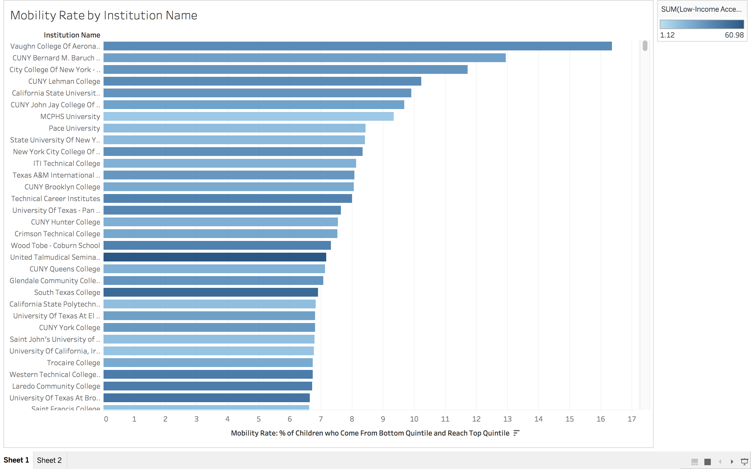
My idea for how we could visualize the Opportunity Project data is dividing into groups focused on data from the institutions in a specific geographic area. As I reflected on my own educational experiences as well as those of people I have grown up with in the Southeast, I wondered if geographical regions have a significant effect on mobility rates and low-income access to education.

The graph pictured above only represents the data for institutions in Alabama but as you can see at the bottom of the image, I have created data charts for all 10 states that the Association of American Geographers classify as “Southeastern” (Alabama, Florida, Georgia, Kentucky, Mississippi, North Carolina, South Carolina, Tennessee, Virginia, and West Virginia).

I think it would be interesting to create similar charts for institutions in the West, Southwest, Midwest, and Northeast and to compare how the data differs among institutions within the same region as well as how the data differs among the different regions in total.


]]>
Data Viz Assignment http://mediawriting.ruthmizu.com/uncategorized/data-viz-assignment/ Wed, 22 Mar 2017 23:04:11 +0000 http://mediawriting.ruthmizu.com/?p=218

]]>