
For this project, I thought it would be interesting to focus on the demographics of the intergenerational mobility. Looking at the data, 4 sections that stood out to me were geography, childhood environment and gender gaps, neighborhoods and parent’s income. I think those factors encompass a good socioeconomic background. To simply analyze the parent’s income does not give enough information. Although income is a major factor in a child’s success, I believe the environment they grow up in is more important. As we were discussing in class, I think splitting the project up into 4 groups would be helpful and more effective. I feel that it might be easier to split into groups after we decide which subjects/factors to focus on, whether that be different colleges or different factors, such as the ones listed above.
]]>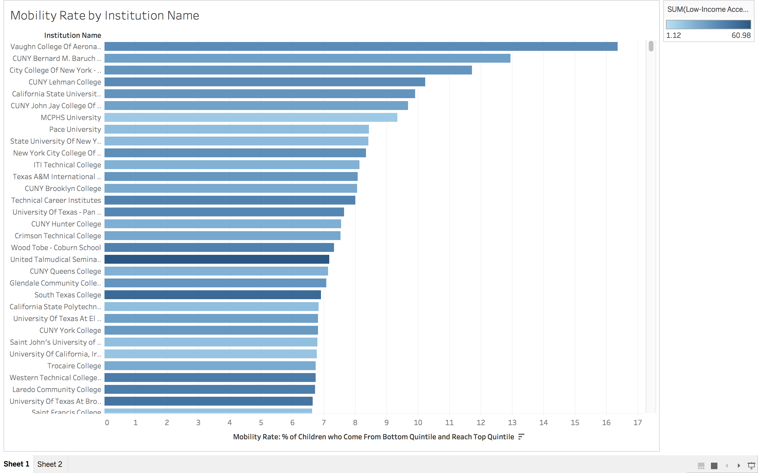
So, maybe I cheated on this one. I’ll let you decide. Above is my sketch of what I envision our data visualization to look like. This is a rough visualization of even that, so maybe that is why I don’t feel so bad about this. I honestly am not sure what else it would look like, but maybe that speaks to my lack of imagination. We currently have a strong understanding of which schools are doing a really good job of helping students move up the income ladder. What we don’t know is why some schools do so well or what the key elements are that enable schools to improve in terms of their mobility statistics. Hopefully we will be able to use the data (and some cool tools) to see what those elements are.
]]>Due: Monday 2/13
As you read Jenkins and Creeber for class on Tuesday, I want you to take some sort of visual notes representing their definitions of new media. You can make your visual notes however you like — the only requirements are that you try your best to summarize and represent the arguments from “Theorizing New Media” and“‘Worship at the Altar of Convergence’: A New Paradigm for Understanding Media Change” and that you somehow you get your representation into a post on your site.
You can draw notes by hand on paper and then scan or take a photo and post them. (I prefer that you scan them — there are scanners around campus, including in the library, but if you take a picture please make some effort to take a good quality picture that we can actually make out.) You can also create your visual representation digitally to begin with in a bunch of different ways.
Some suggestions include:
- Mind mapping or concept mapping software like bubbl.us or this concept map maker.
- Flowchart/concept mapping software like LucidChart.
- Check out Derek Bruff’s page on Visual Thinking techniques and see if you get other ideas from him.
The goal with this assignment is just to get you to play around with visualization techniques instead of relying solely on text to convey information. We’ll spend some time looking at the visualizations as we discuss the chapters on Tuesday.
Remember that this is just a sketch assignment — you don’t need to produce beautiful designs and you should not spend tons of time on this. Read the articles carefully and then spend a little bit of time sketching out your visuals, then post them. This is not polished, major assignment work but a sketch.
Tag your posts with however many tags seem appropriate, so long as one of them is “sketch4”
Visual Notes
I’m a big fan of the work of Giulia Forsyth. She works in a teaching and learning center, where she helps professors and instructors be more innovative in their teaching practices, and she also works as a visual note-taker and facilitator, which means that she is sometimes employed to go to presentations and meetings and to doodle notes for the meeting.
Check out this four minute video where she gives a quick summary of how she began to take her doodling seriously and where it has led her:
On her Visual Practice page, Forsyth has lots of videos and images explaining how she approaches the task of producing drawings that help her and others to not just grab the information that’s been presented in a class or discussion, but to grapple with the material and better understand it. You can also see numerous examples on her Flickr page, especially her Visual Practice album.
I’m not asking you to take visual notes in real time in the same way that Forsyth does (though I would encourage you to try something like that!) so the technological choices for you are much easier, but I hope that the resources above are helpful in getting you to think through why this sort of practice might be helpful.
]]>