
A quick design I made that aims to capture both the modern and clean, while presenting stark colors to demonstrate uncertainty.
]]>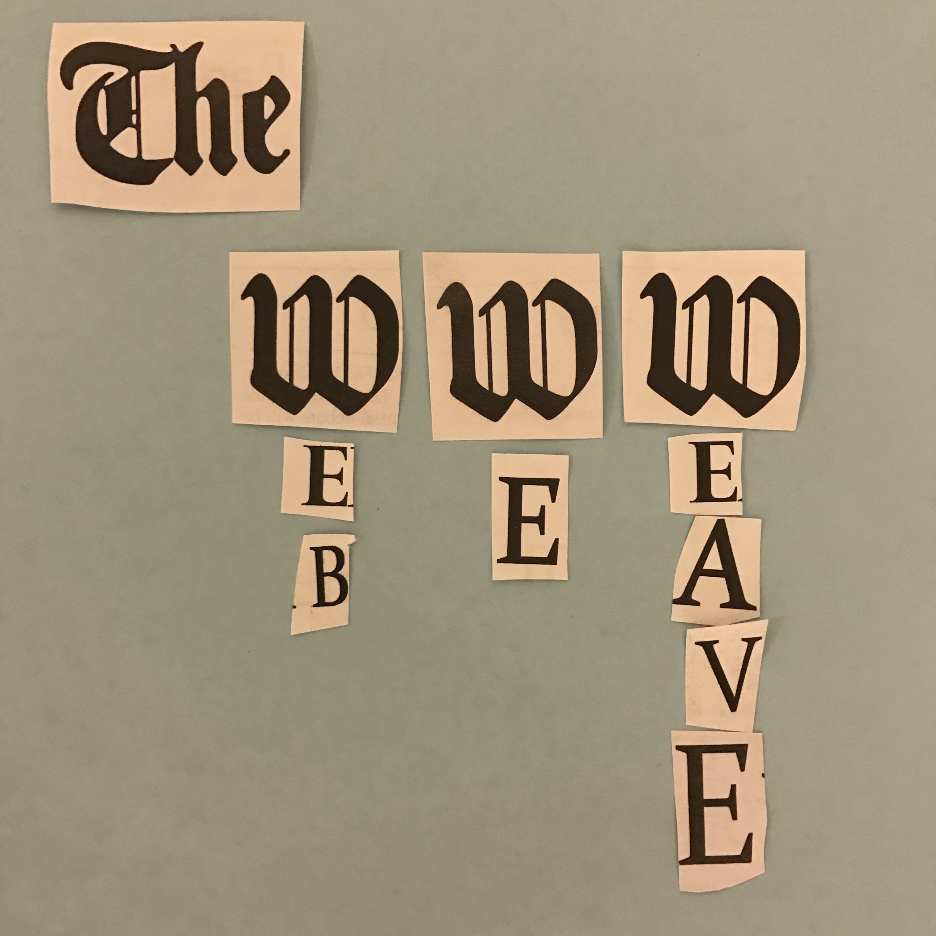
For our podcast image, I didn’t realize I was supposed to post it on our pages as a post so I put it in the class ublend first like a total noob. Oh well. I went in on the [www] look and shot for a sort of retro design with the newspaper cutouts and traditional font of the W’s. I tried at least, and I’ve heard people say that that’s what counts.
]]>
This design shows a meticulous web cast over a symmetrical view of two skyscrapers. I tried to incorporate both images to show that everything in new age media is seemingly connected to the industries that satisfy us, as consumers (whether passively or actively.)
Source: http://www.minojh-multimedia.com/services/

the city lights which seemingly give off an illusion of a grid/web is why I chose this design. It represents the fast pace, consumer minded society that we all function in; but even more, it serves as a representation of our lives (voluntarily or not), where the ‘go’ is equated to success and the connections and bonds formed between us are the ‘webs we weave.’
]]>
Source: https://www.flickr.com/photos/101295317@N06/
]]>
I made my logo on Canva. First time using it, don’t really know how to use it. I would have liked the background of the social media accounts to be faded in and for the title “THE WEB WE WEAVE” to be a wavy font or something. I didn’t know how to change the text font. I personally really like the background image and the idea of adding social media icons, but a person with better graphic design abilities I feel like can make it look way nicer.
]]>
I made my logo using Canva. This was my first experience with this program but I found it easy to use. My original idea was different from what I ended up making. I just played around with different elements and settled on this.
]]>

This is an idea I had for the potential logo by playing around with some fonts and images. I emphasized WWW more than the “web we weave” and kept it in a simple black and white color scheme. This image took on a more literal approach, which is why I focused on “www.” to convey that the goal of this podcast was to analyze new media writing.
]]>
Above is the image I designed for the podcast. Originally I wanted to play off of the stacked words or the lowercase lettering. However, the alliteration made me think of somehow combining the words into one and adding a digital aspect. That idea sparked the above graphic which I’m fond of, but I wouldn’t mind editing it to make it better.
]]>