
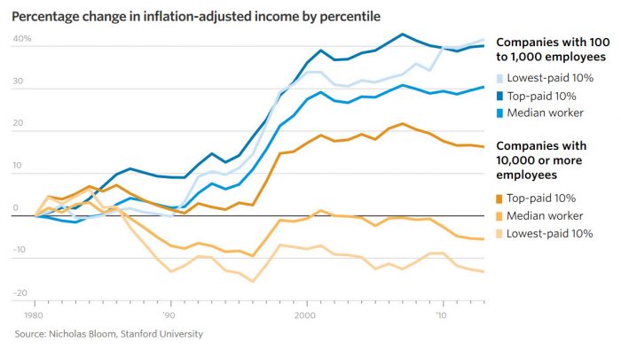
On the subject of data, income inequality, and your economic futures, the Wall Street Journal has a data visualization article today entitled “Why Americans Are More Likely to Work for a Large Employer, in 20 Charts” (paid subscription required). Here’s a single chart from that article
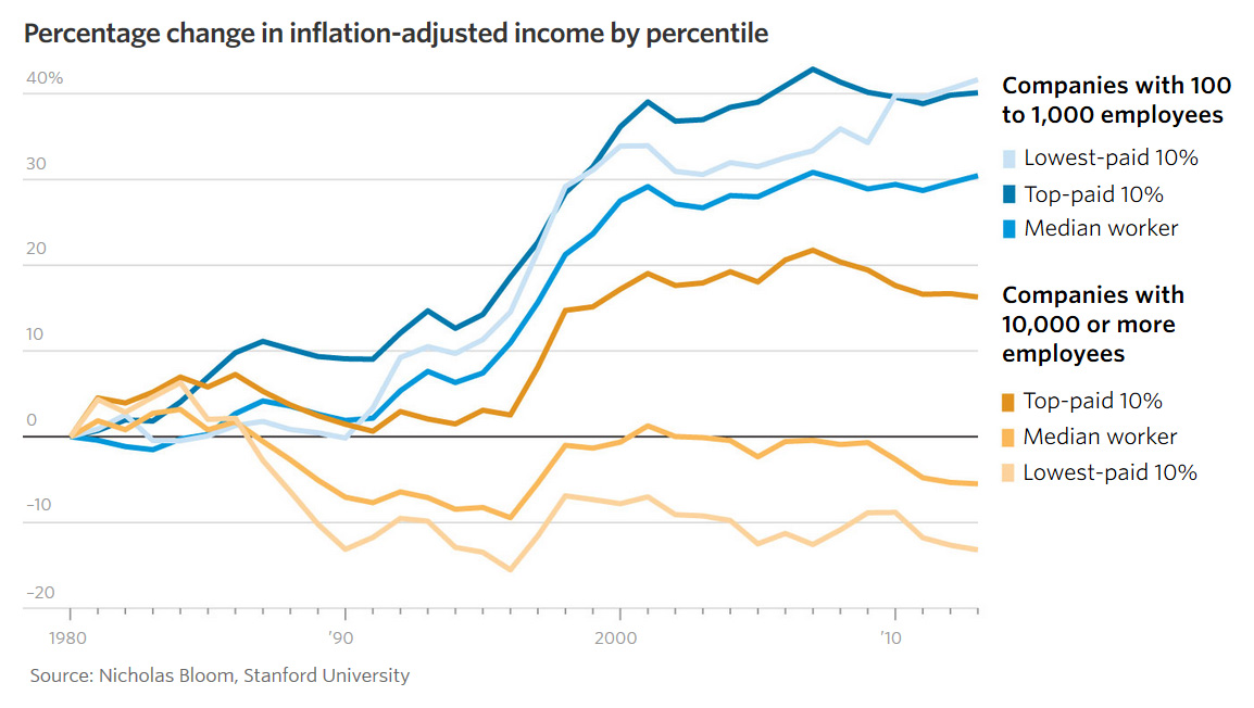
Large companies (10,000 employees or more) are increasingly where Americans work and according to the chart, 90% of those employees earn less now than employees in those companies earned in 1980, and even the top 10% of employees in those companies only make about 15% more now than they did in 1980. Clearly, the executives and shareholders are taking an increasingly large share of the profits of those companies, rather than reinvesting those profits back into the labor force.
Meanwhile, medium-sized companies (100 – 1,000 employees), which are an increasingly small sector of the workforce, show all employees making at least 30% more now than they did in 1980.
What sorts of conclusions might you draw from this information?